R How to Make Daily Data Look Continuous
This tutorial uses ggplot2 to create customized plots of time series data. We will learn how to adjust x- and y-axis ticks using the scales package, how to add trend lines to a scatter plot and how to customize plot labels, colors and overall plot appearance using ggthemes.
Plotting Time Series Data
Plotting our data allows us to quickly see general patterns including outlier points and trends. Plots are also a useful way to communicate the results of our research. ggplot2 is a powerful R package that we use to create customized, professional plots.
Load the Data
We will use the lubridate, ggplot2, scales and gridExtra packages in this tutorial.
Our data subset will be the daily meteorology data for 2009-2011 for the NEON Harvard Forest field site (NEON-DS-Met-Time-Series/HARV/FisherTower-Met/Met_HARV_Daily_2009_2011.csv). If this subset is not already loaded, please load it now.
# Remember it is good coding technique to add additional packages to the top of # your script library(lubridate) # for working with dates library(ggplot2) # for creating graphs library(scales) # to access breaks/formatting functions library(gridExtra) # for arranging plots # set working directory to ensure R can find the file we wish to import wd <- "~/Git/data/" # daily HARV met data, 2009-2011 harMetDaily.09.11 <- read.csv( file=paste0(wd,"NEON-DS-Met-Time-Series/HARV/FisherTower-Met/Met_HARV_Daily_2009_2011.csv"), stringsAsFactors = FALSE) # covert date to Date class harMetDaily.09.11$date <- as.Date(harMetDaily.09.11$date) # monthly HARV temperature data, 2009-2011 harTemp.monthly.09.11<-read.csv( file=paste0(wd,"NEON-DS-Met-Time-Series/HARV/FisherTower-Met/Temp_HARV_Monthly_09_11.csv"), stringsAsFactors=FALSE ) # datetime field is actually just a date #str(harTemp.monthly.09.11) # convert datetime from chr to date class & rename date for clarification harTemp.monthly.09.11$date <- as.Date(harTemp.monthly.09.11$datetime) Plot with qplot
We can use the qplot() function in the ggplot2 package to quickly plot a variable such as air temperature (airt) across all three years of our daily average time series data.
# plot air temp qplot(x=date, y=airt, data=harMetDaily.09.11, na.rm=TRUE, main="Air temperature Harvard Forest\n 2009-2011", xlab="Date", ylab="Temperature (°C)") 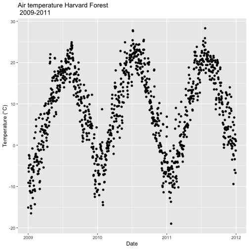
The resulting plot displays the pattern of air temperature increasing and decreasing over three years. While qplot() is a quick way to plot data, our ability to customize the output is limited.
Plot with ggplot
The ggplot() function within the ggplot2 package gives us more control over plot appearance. However, to use ggplot we need to learn a slightly different syntax. Three basic elements are needed for ggplot() to work:
- The data_frame: containing the variables that we wish to plot,
-
aes(aesthetics): which denotes which variables will map to the x-, y- (and other) axes, -
geom_XXXX(geometry): which defines the data's graphical representation (e.g. points (geom_point), bars (geom_bar), lines (geom_line), etc).
The syntax begins with the base statement that includes the data_frame (harMetDaily.09.11) and associated x (date) and y (airt) variables to be plotted:
ggplot(harMetDaily.09.11, aes(date, airt))
To successfully plot, the last piece that is needed is the geometry type. In this case, we want to create a scatterplot so we can add + geom_point().
Let's create an air temperature scatterplot.
# plot Air Temperature Data across 2009-2011 using daily data ggplot(harMetDaily.09.11, aes(date, airt)) + geom_point(na.rm=TRUE) 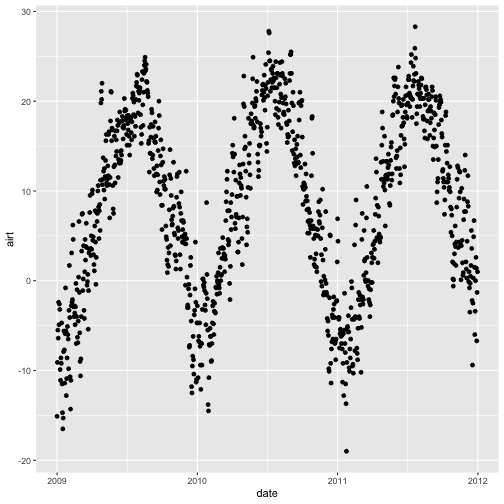
Customize A Scatterplot
We can customize our plot in many ways. For instance, we can change the size and color of the points using size=, shape pch=, and color= in the geom_point element.
geom_point(na.rm=TRUE, color="blue", size=1)
# plot Air Temperature Data across 2009-2011 using daily data ggplot(harMetDaily.09.11, aes(date, airt)) + geom_point(na.rm=TRUE, color="blue", size=3, pch=18) 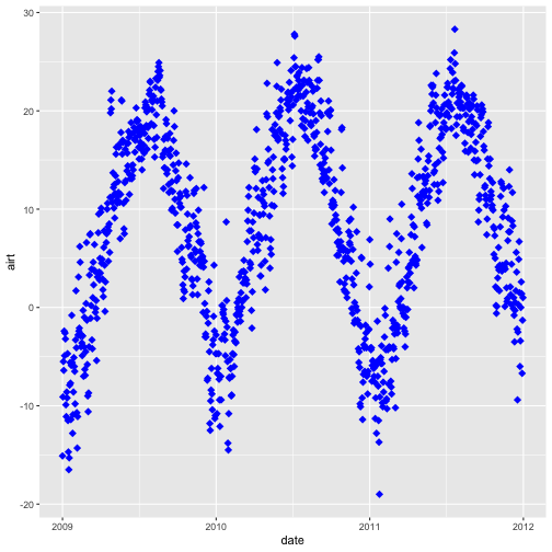
Modify Title & Axis Labels
We can modify plot attributes by adding elements using the + symbol. For example, we can add a title by using + ggtitle="TEXT", and axis labels using + xlab("TEXT") + ylab("TEXT").
# plot Air Temperature Data across 2009-2011 using daily data ggplot(harMetDaily.09.11, aes(date, airt)) + geom_point(na.rm=TRUE, color="blue", size=1) + ggtitle("Air Temperature 2009-2011\n NEON Harvard Forest Field Site") + xlab("Date") + ylab("Air Temperature (C)") 
**Data Tip:** Use `help(ggplot2)` to review the many elements that can be defined and added to a `ggplot2` plot.
Name Plot Objects
We can create a ggplot object by assigning our plot to an object name. When we do this, the plot will not render automatically. To render the plot, we need to call it in the code.
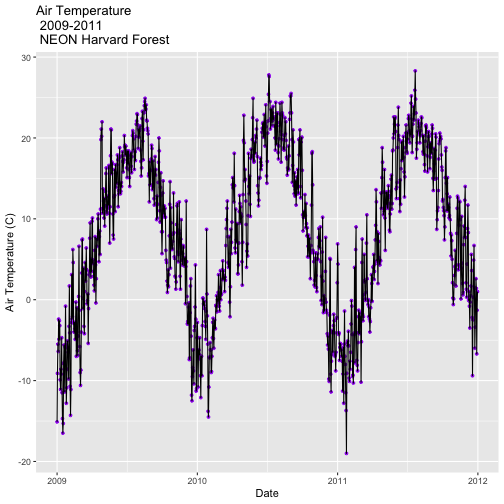
Assigning plots to an R object allows us to effectively add on to, and modify the plot later. Let's create a new plot and call it AirTempDaily.
# plot Air Temperature Data across 2009-2011 using daily data AirTempDaily <- ggplot(harMetDaily.09.11, aes(date, airt)) + geom_point(na.rm=TRUE, color="purple", size=1) + ggtitle("Air Temperature\n 2009-2011\n NEON Harvard Forest") + xlab("Date") + ylab("Air Temperature (C)") # render the plot AirTempDaily 
Format Dates in Axis Labels
We can adjust the date display format (e.g. 2009-07 vs. Jul 09) and the number of major and minor ticks for axis date values using scale_x_date. Let's format the axis ticks so they read "month year" (%b %y). To do this, we will use the syntax:
scale_x_date(labels=date_format("%b %y")
Rather than re-coding the entire plot, we can add the scale_x_date element to the plot object AirTempDaily that we just created.
**Data Tip:** You can type `?strptime` into the R console to find a list of date format conversion specifications (e.g. %b = month). Type `scale_x_date` for a list of parameters that allow you to format dates on the x-axis.
# format x-axis: dates AirTempDailyb <- AirTempDaily + (scale_x_date(labels=date_format("%b %y"))) AirTempDailyb 
**Data Tip:** If you are working with a date & time class (e.g. POSIXct), you can use `scale_x_datetime` instead of `scale_x_date`.
Adjust Date Ticks
We can adjust the date ticks too. In this instance, having 1 tick per year may be enough. If we have the scales package loaded, we can use breaks=date_breaks("1 year") within the scale_x_date element to create a tick for every year. We can adjust this as needed (e.g. 10 days, 30 days, 1 month).
From R HELP (
?date_breaks):widthan interval specification, one of "sec", "min", "hour", "day", "week", "month", "year". Can be by an integer and a space, or followed by "s".
# format x-axis: dates AirTempDaily_6mo <- AirTempDaily + (scale_x_date(breaks=date_breaks("6 months"), labels=date_format("%b %y"))) AirTempDaily_6mo 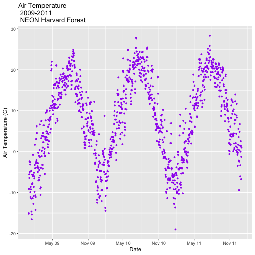
# format x-axis: dates AirTempDaily_1y <- AirTempDaily + (scale_x_date(breaks=date_breaks("1 year"), labels=date_format("%b %y"))) AirTempDaily_1y 
**Data Tip:** We can adjust the tick spacing and format for x- and y-axes using `scale_x_continuous` or `scale_y_continuous` to format a continue variable. Check out `?scale_x_` (tab complete to view the various x and y scale options)
ggplot - Subset by Time
Sometimes we want to scale the x- or y-axis to a particular time subset without subsetting the entire data_frame. To do this, we can define start and end times. We can then define the limits in the scale_x_date object as follows:
scale_x_date(limits=start.end) +
# Define Start and end times for the subset as R objects that are the time class startTime <- as.Date("2011-01-01") endTime <- as.Date("2012-01-01") # create a start and end time R object start.end <- c(startTime,endTime) start.end ## [1] "2011-01-01" "2012-01-01" # View data for 2011 only # We will replot the entire plot as the title has now changed. AirTempDaily_2011 <- ggplot(harMetDaily.09.11, aes(date, airt)) + geom_point(na.rm=TRUE, color="purple", size=1) + ggtitle("Air Temperature\n 2011\n NEON Harvard Forest") + xlab("Date") + ylab("Air Temperature (C)")+ (scale_x_date(limits=start.end, breaks=date_breaks("1 year"), labels=date_format("%b %y"))) AirTempDaily_2011 
ggplot() Themes
We can use the theme() element to adjust figure elements. There are some nice pre-defined themes that we can use as a starting place.
# Apply a black and white stock ggplot theme AirTempDaily_bw<-AirTempDaily_1y + theme_bw() AirTempDaily_bw 
Using the theme_bw() we now have a white background rather than grey.
Import New Themes Bonus Topic
There are externally developed themes built by the R community that are worth mentioning. Feel free to experiment with the code below to install ggthemes.
# install additional themes # install.packages('ggthemes', dependencies = TRUE) library(ggthemes) AirTempDaily_economist<-AirTempDaily_1y + theme_economist() AirTempDaily_economist 
AirTempDaily_strata<-AirTempDaily_1y + theme_stata() AirTempDaily_strata 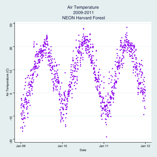
More on Themes
Hadley Wickham's documentation.
- Zev Ross on themes.
A list of themes loaded in the ggthemes library is found here.
Customize ggplot Themes
We can customize theme elements manually too. Let's customize the font size and style.
# format x axis with dates AirTempDaily_custom<-AirTempDaily_1y + # theme(plot.title) allows to format the Title separately from other text theme(plot.title = element_text(lineheight=.8, face="bold",size = 20)) + # theme(text) will format all text that isn't specifically formatted elsewhere theme(text = element_text(size=18)) AirTempDaily_custom 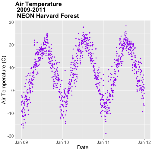
### Challenge: Plot Total Daily Precipitation Create a plot of total daily precipitation using data in the `harMetDaily.09.11` `data_frame`.
- Format the dates on the x-axis:
Month-Year. - Create a plot object called
PrecipDaily. - Be sure to add an appropriate title in addition to x and y axis labels.
- Increase the font size of the plot text and adjust the number of ticks on the x-axis.
Bar Plots with ggplot
We can use ggplot to create bar plots too. Let's create a bar plot of total daily precipitation next. A bar plot might be a better way to represent a total daily value. To create a bar plot, we change the geom element from geom_point() to geom_bar().
The default setting for a ggplot bar plot - geom_bar() - is a histogram designated by stat="bin". However, in this case, we want to plot actual precipitation values. We can use geom_bar(stat="identity") to force ggplot to plot actual values.
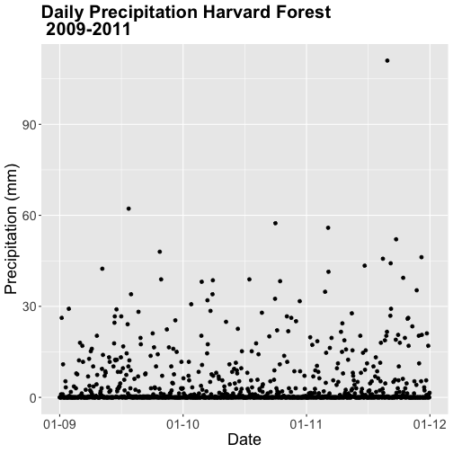
# plot precip PrecipDailyBarA <- ggplot(harMetDaily.09.11, aes(date, prec)) + geom_bar(stat="identity", na.rm = TRUE) + ggtitle("Daily Precipitation\n Harvard Forest") + xlab("Date") + ylab("Precipitation (mm)") + scale_x_date(labels=date_format ("%b %y"), breaks=date_breaks("1 year")) + theme(plot.title = element_text(lineheight=.8, face="bold", size = 20)) + theme(text = element_text(size=18)) PrecipDailyBarA 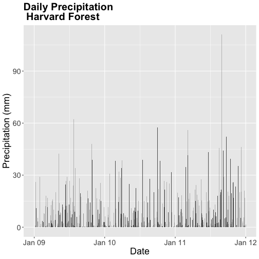
Note that some of the bars in the resulting plot appear grey rather than black. This is because R will do it's best to adjust colors of bars that are closely spaced to improve readability. If we zoom into the plot, all of the bars are black.
### Challenge: Plot with scale_x_data() Without creating a subsetted dataframe, plot the precipitation data for *2010 only*. Customize the plot with:
- a descriptive title and axis labels,
- breaks every 4 months, and
- x-axis labels as only the full month (spelled out).
HINT: you will need to rebuild the precipitation plot as you will have to specify a new scale_x_data() element.
Bonus: Style your plot with a ggtheme of choice.
## Warning: Removed 729 rows containing missing values (position_stack). 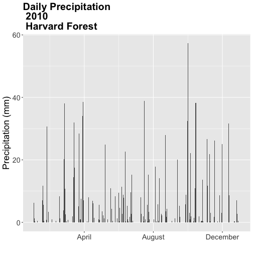
Color
We can change the bar fill color by within the geom_bar(colour="blue") element. We can also specify a separate fill and line color using fill= and line=. Colors can be specified by name (e.g., "blue") or hexadecimal color codes (e.g, #FF9999).
- An R color cheatsheet
There are many color cheatsheets out there to help with color selection!
# specifying color by name PrecipDailyBarB <- PrecipDailyBarA+ geom_bar(stat="identity", colour="darkblue") PrecipDailyBarB 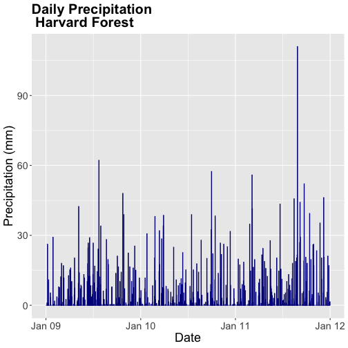
**Data Tip:** For more information on color, including color blind friendly color palettes, checkout the ggplot2 color information from Winston Chang's *Cookbook* *for* *R* site based on the _R_ _Graphics_ _Cookbook_ text.
Figures with Lines
We can create line plots too using ggplot. To do this, we use geom_line() instead of bar or point.
AirTempDaily_line <- ggplot(harMetDaily.09.11, aes(date, airt)) + geom_line(na.rm=TRUE) + ggtitle("Air Temperature Harvard Forest\n 2009-2011") + xlab("Date") + ylab("Air Temperature (C)") + scale_x_date(labels=date_format ("%b %y")) + theme(plot.title = element_text(lineheight=.8, face="bold", size = 20)) + theme(text = element_text(size=18)) AirTempDaily_line 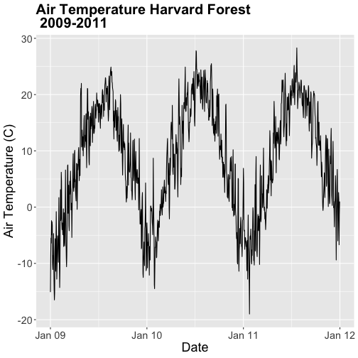
Note that lines may not be the best way to represent air temperature data given lines suggest that the connecting points are directly related. It is important to consider what type of plot best represents the type of data that you are presenting.
### Challenge: Combine Points & Lines You can combine geometries within one plot. For example, you can have a `geom_line()` and `geom_point` element in a plot. Add `geom_line(na.rm=TRUE)` to the `AirTempDaily`, a `geom_point` plot. What happens?
Trend Lines
We can add a trend line, which is a statistical transformation of our data to represent general patterns, using stat_smooth(). stat_smooth() requires a statistical method as follows:
- For data with < 1000 observations: the default model is a loess model (a non-parametric regression model)
- For data with > 1,000 observations: the default model is a GAM (a general additive model)
- A specific model/method can also be specified: for example, a linear regression (
method="lm").
For this tutorial, we will use the default trend line model. The gam method will be used with given we have 1,095 measurements.
**Data Tip:** Remember a trend line is a statistical transformation of the data, so prior to adding the line one must understand if a particular statistical transformation is appropriate for the data.
# adding on a trend lin using loess AirTempDaily_trend <- AirTempDaily + stat_smooth(colour="green") AirTempDaily_trend ## `geom_smooth()` using method = 'gam' and formula 'y ~ s(x, bs = "cs")' 
### Challenge: A Trend in Precipitation?
Create a bar plot of total daily precipitation. Add a:
- Trend line for total daily precipitation.
- Make the bars purple (or your favorite color!).
- Make the trend line grey (or your other favorite color).
- Adjust the tick spacing and format the dates to appear as "Jan 2009".
- Render the title in italics.
## `geom_smooth()` using formula 'y ~ x' 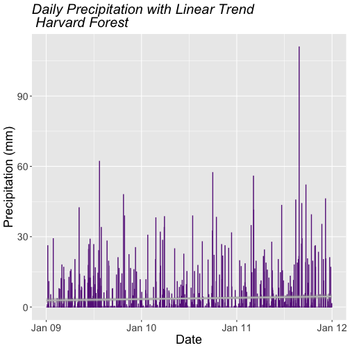
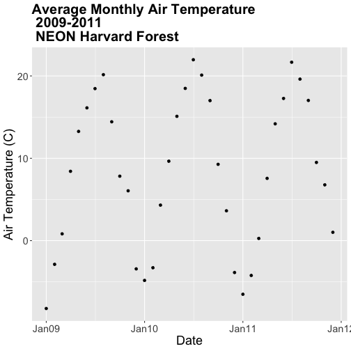
### Challenge: Plot Monthly Air Temperature
Plot the monthly air temperature across 2009-2011 using the harTemp.monthly.09.11 data_frame. Name your plot "AirTempMonthly". Be sure to label axes and adjust the plot ticks as you see fit.
Display Multiple Figures in Same Panel
It is often useful to arrange plots in a panel rather than displaying them individually. In base R, we use par(mfrow=()) to accomplish this. However the grid.arrange() function from the gridExtra package provides a more efficient approach!
grid.arrange requires 2 things:
- the names of the plots that you wish to render in the panel.
- the number of columns (
ncol).
grid.arrange(plotOne, plotTwo, ncol=1)
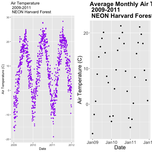
Let's plot AirTempMonthly and AirTempDaily on top of each other. To do this, we'll specify one column.
# note - be sure library(gridExtra) is loaded! # stack plots in one column grid.arrange(AirTempDaily, AirTempMonthly, ncol=1) 
### Challenge: Create Panel of Plots
Plot AirTempMonthly and AirTempDaily next to each other rather than stacked on top of each other.
Additional ggplot2 Resources
In this tutorial, we've covered the basics of ggplot. There are many great resources the cover refining ggplot figures. A few are below:
- ggplot2 Cheatsheet from Zev Ross: ggplot2 Cheatsheet
- ggplot2 documentation index: ggplot2 Documentation
Source: https://www.neonscience.org/resources/learning-hub/tutorials/dc-time-series-plot-ggplot-r
Post a Comment for "R How to Make Daily Data Look Continuous"